The Material Design is getting more and more popular day by day. Designers are talking about this and there are many websites designed using Material Design.
The Material Design using more grid-based layouts, responsive animations and transitions, padding, and depth effects such as lighting and shadows. So you can create great design using this.
In our previous tutorial you have learned how to design Login and Register Form using Material Design. In this tutorial you will learn how to create Drop down Menus using material Design. The tutorial will cover drop down menus design with demo and complete demo script to download.
Also, read:
So let’s start,
Before begin, take a look of files structure used for this tutorial.
- index.php
- style.css
Include Material Design CSS
First we will include Material Design CSS and drop down CSS files to create drop down using Material Design. We will include following files
<link rel="stylesheet" href="https://cdnjs.cloudflare.com/ajax/libs/materialize/0.97.1/css/materialize.min.css">
<link rel="stylesheet" href="css/style.css">
Create Material Design Drop Down Menus HTML
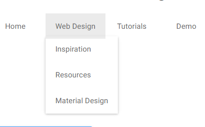
Now we will create Material Design Drop down menus HTML in index.php file. Here will use CSS class drop to create drop down menu.
<h4>Create Material Design Drop Down Menu</h4>
<ul class="nav">
	<li><a href="#">Home</a></li>
	<li class="drop">Web Design
	<ul>
		<li><a href="#">Inspiration</a></li>
		<li><a href="#">Resources</a></li>
		<li><a href="#">Material Design</a></li>
	</ul>
	</li>
	<li class="drop">Tutorials
	<ul>
		<li><a >jQuery</a></li>
		<li><a href="#">PHP</a></li>
		<li><a href="#">Material Design</a></li>
		<li><a href="#">CSS</a></li>
	</ul>
	</li>
	<li><a href="#">Demo</a></li>
</ul>
CSS For Drop Down Menus
Here is the CSS for the drop down menus.
h1, a, li {
  font-family: Roboto, sans-serif;
}
h1 {
  font-size: 26px;
  background: #9b50ba;
  color: white;
  padding: 40px 0 40px 20%;
  margin-bottom: 50px;
}
a, li {
  color: #6b6b6b;
  text-decoration: none;
}
.nav > li {
  display: inline-block;
  padding: 1em 18px;
  cursor: pointer;
}
.nav > li:hover {
  background: #ebebeb;
}
.drop {
  position: relative;
}
.drop ul {
  position: absolute;
  left: 0;
  top: 3em;
  -webkit-transition: all 0.3s ease;
  transition: all 0.3s ease;
  -webkit-transform: scale(0);
          transform: scale(0);
  -webkit-transform-origin: 0 0;
          transform-origin: 0 0;
  box-shadow: 0 2px 4px 0 rgba(0, 0, 0, 0.16), 0 2px 8px 0 rgba(0, 0, 0, 0.12);
}
.drop ul li {
  display: block;
  width: 100%;
}
.drop ul li a {
  width: 100%;
  padding: 1em 18px;
  display: inline-block;
  white-space: pre;
  box-sizing: border-box;
}
.drop ul li a:hover {
  background: #ebebeb;
}
.drop:hover ul {
  -webkit-transform: scale(1);
  transform: scale(1);
}
You may also like:
- User Management System with PHP & MySQL
- Datatables Add Edit Delete with Ajax, PHP & MySQL
- Build Helpdesk System with jQuery, PHP & MySQL
- Build Online Voting System with PHP & MySQL
- School Management System with PHP & MySQL
- DataTables Add Edit Delete with CodeIgniter
- Create RESTful API using CodeIgniter
- Build Reusable Captcha Script with PHP
- Product Search Filtering using Ajax, PHP & MySQL
- Image Upload and Crop in Modal with jQuery, PHP & MySQL
- Build Push Notification System with PHP & MySQL
- Project Management System with PHP and MySQL
- Hospital Management System with PHP & MySQL
- Build Newsletter System with PHP and MySQL
- Skeleton Screen Loading Effect with Ajax and PHP
- Build Discussion Forum with PHP and MySQL
- Customer Relationship Management (CRM) System with PHP & MySQL
- Online Exam System with PHP & MySQL
- Expense Management System with PHP & MySQL
You can view the live demo from the Demo link and can download the script from the Download link below.
Demo Download